
Stories
Capilano College symbol is unveiled
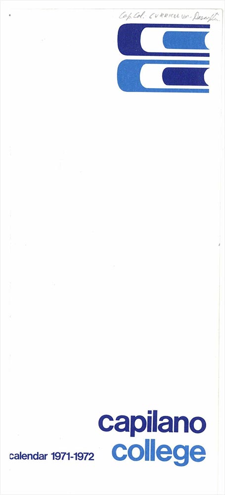
Coming up with a symbol to represent Capilano College was no easy feat. It took three years, several contests and lengthy consultation before the final symbol was unveiled in 1971.
The College—which was named after Chief Joe Capilano, an important leader of the Squamish (Sḵwx̱wú7mesh) Nation—had been looking for a symbol since it first opened in 1968, and had used a number of temporary ones, including a First Nations thunderbird and a whale’s head, in the meantime.
Initially, students were challenged to submit their ideas through contests, but none of the designs gained wide support. So, West Vancouver graphic artist, David Watson, was hired. After consulting with students and faculty, he submitted a series of designs to the College Council, which were then displayed at Park Royal to gauge community sentiment.
The successful design was unveiled by A. H. Glenesk, Capilano College’s first principal in July 1971.
Watson’s design aimed to capture the young, progressive and dynamic outlook of the new college, while also recognizing its First Nations heritage.
“A place of learning, with an Indian name and located by the sea were the features that we decided to work on,” said Watson in a 1971 interview with the Lions Gate Times. “These were covered, we felt, by using the general shape of the feather formation from the Indian thunderbird design. The space inside the C’s we formed into book silhouettes. The dark and light blue colour scheme was intended to represent the sea and the sky.”
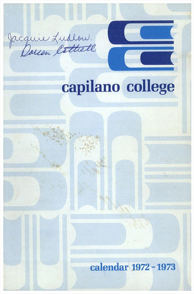
The symbol was part of the College’s visual identity for 37 years until Capilano was redesignated as a university by the provincial government in 2008, and a new university logo was created. That logo was later replaced in 2017 when the University rebranded, but that’s another story.
Written by: Shannon Colin