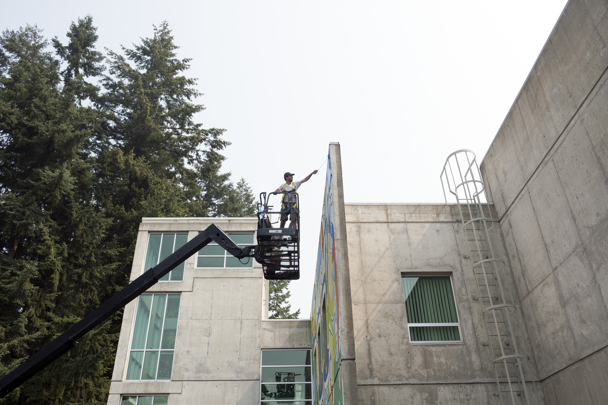
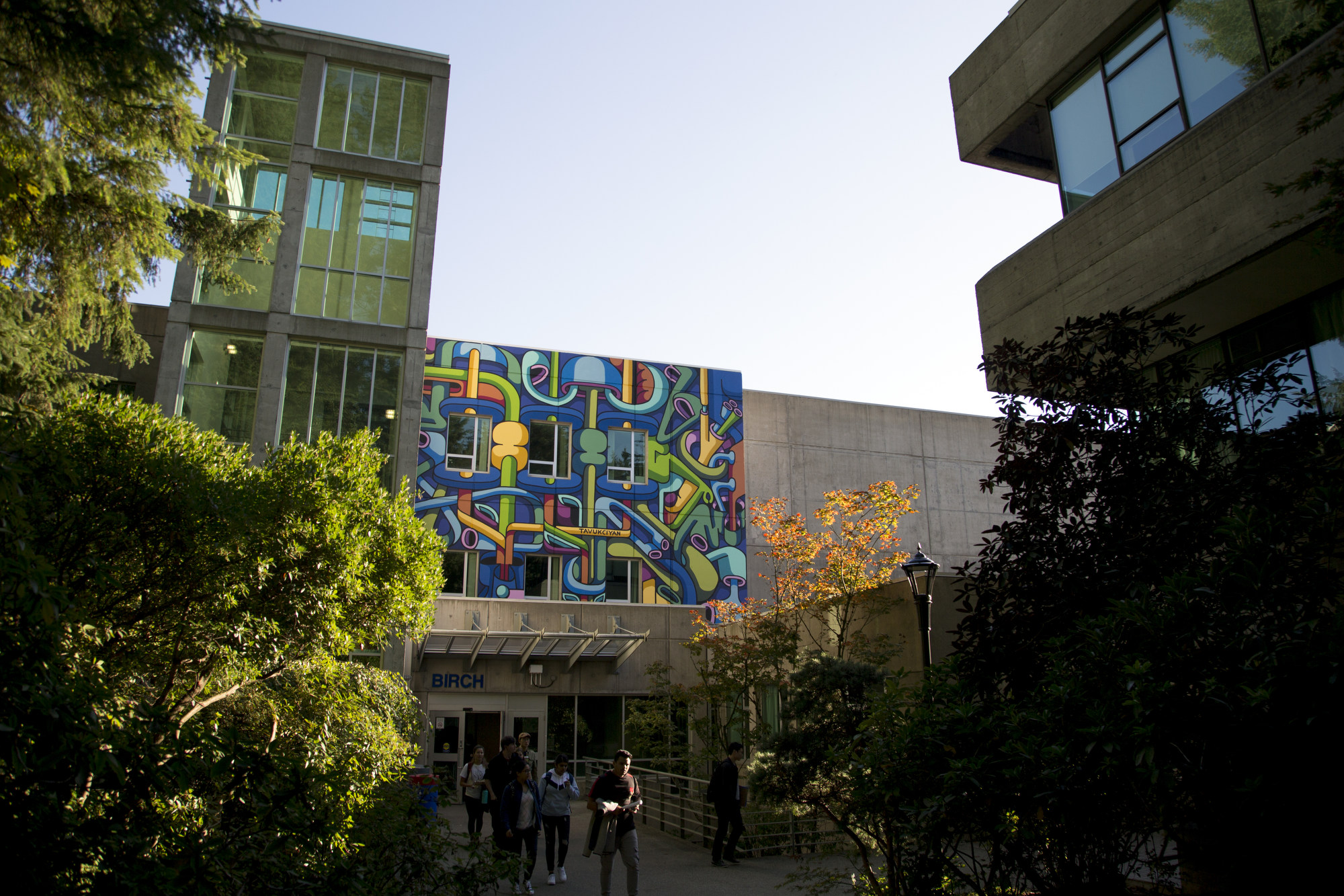
CapU Murals Project
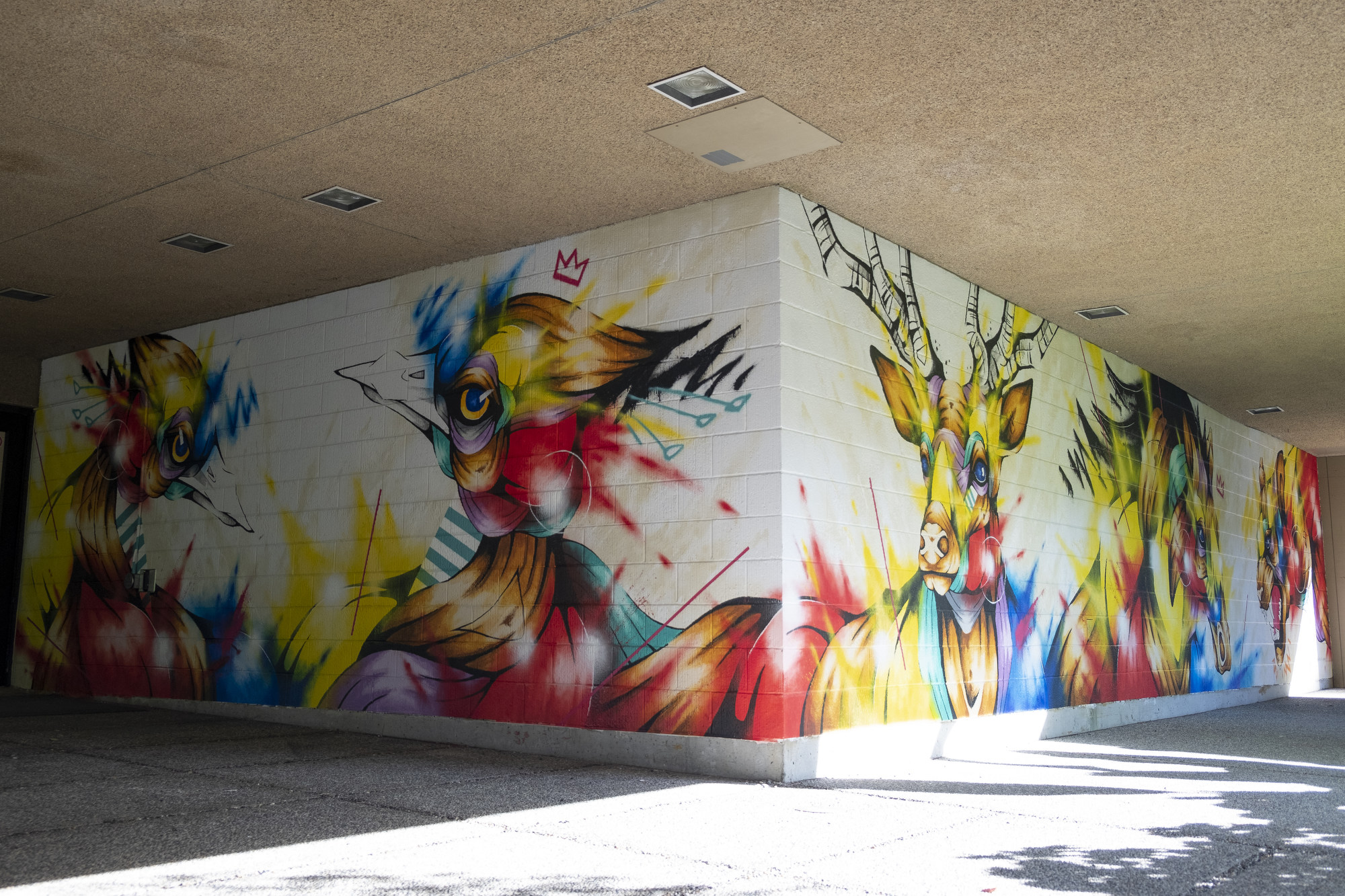
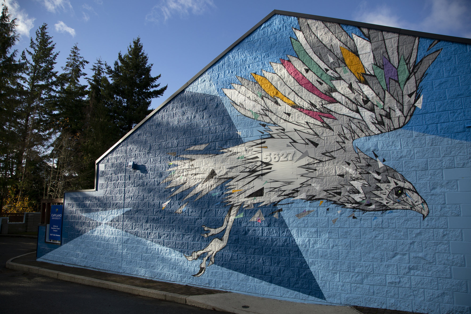
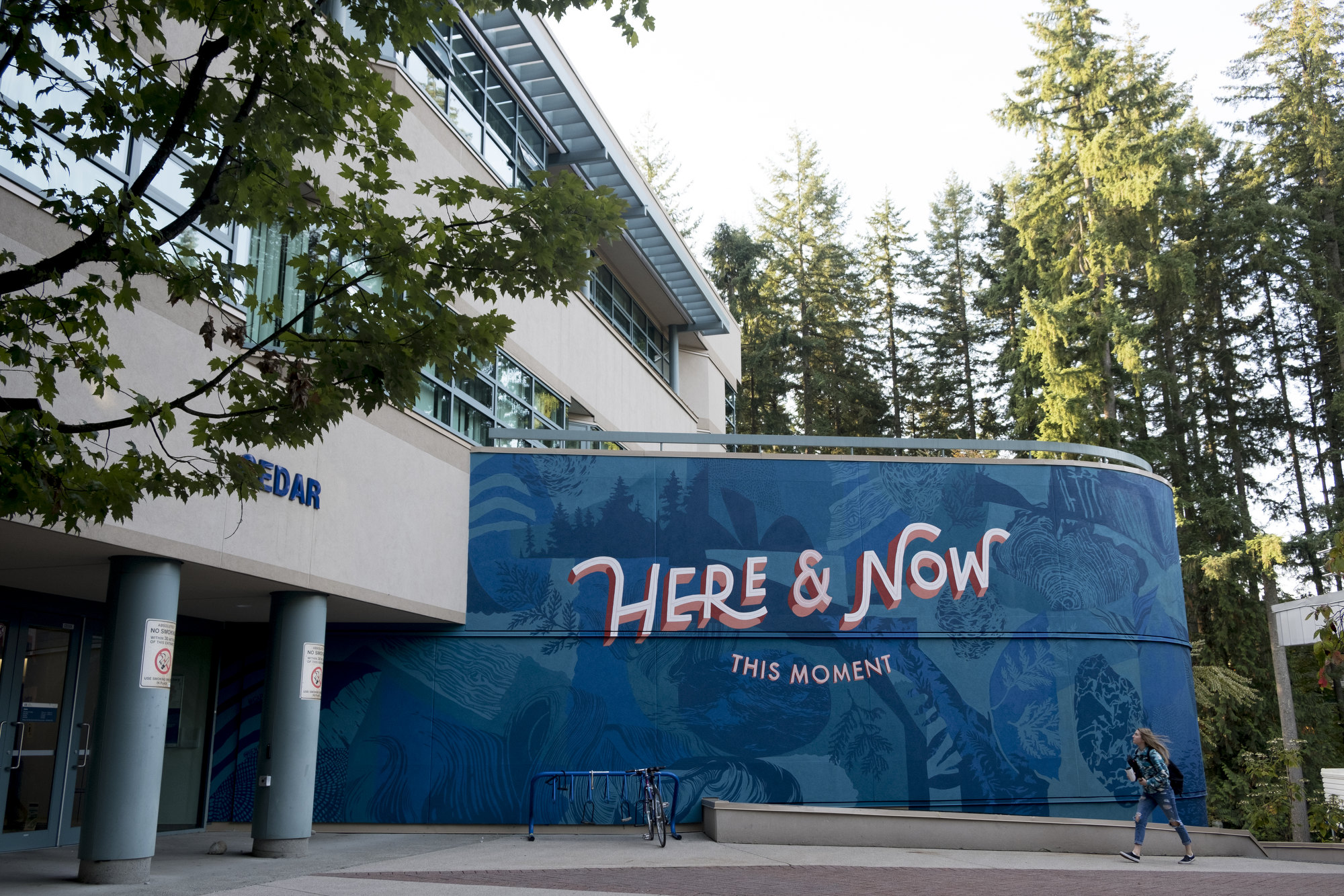
Vibrant images are bursting off nine prominent exterior walls at Capilano University’s North Vancouver campus and one at kálax-ay, the Sunshine Coast campus, to mark CapU’s 50th anniversary.
The University teamed up with the Vancouver Mural Festival to find artists to transform drab concrete walls with full-colour painted murals that symbolize the creativity that distinguishes Capilano University.
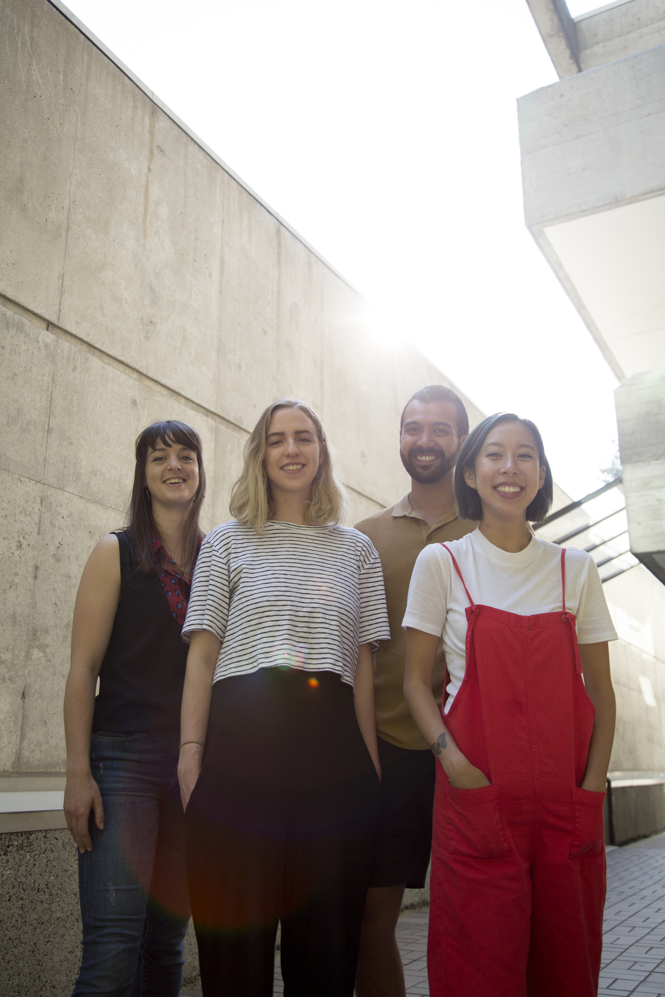
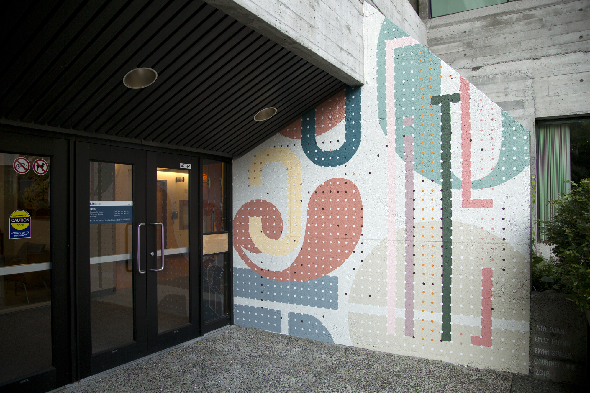
Taka Sudo Emily Hyunh, Courtney Lamb, Ata Ojani & Brynn Staples Carrielynn Victor & Debra Sparrow Ben Tour Andrew Tavukciyan Cristian Fowlie Erica Phillips Drew Young Nelson Garcia & Xochitl Leal Tierney Milne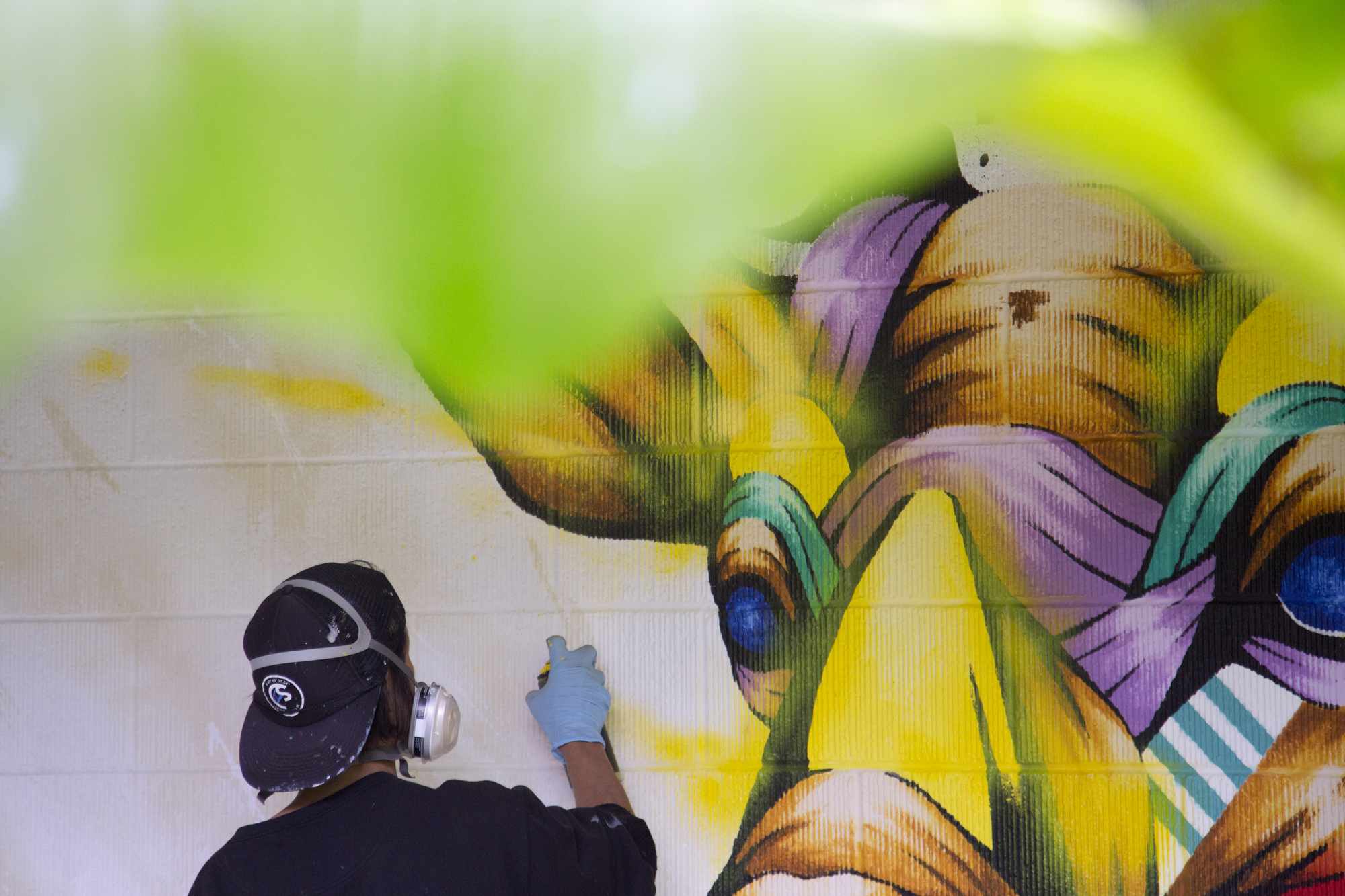
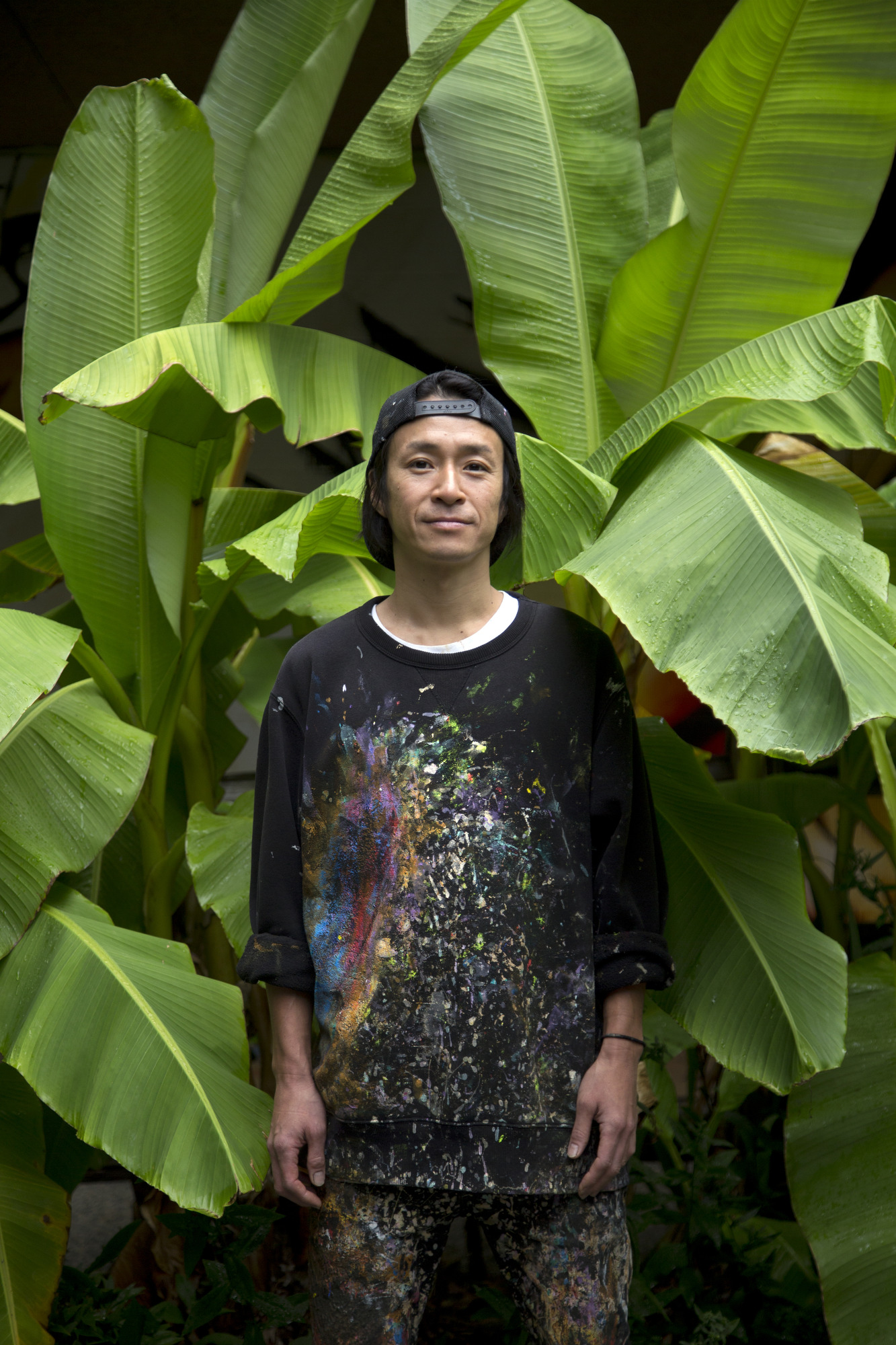
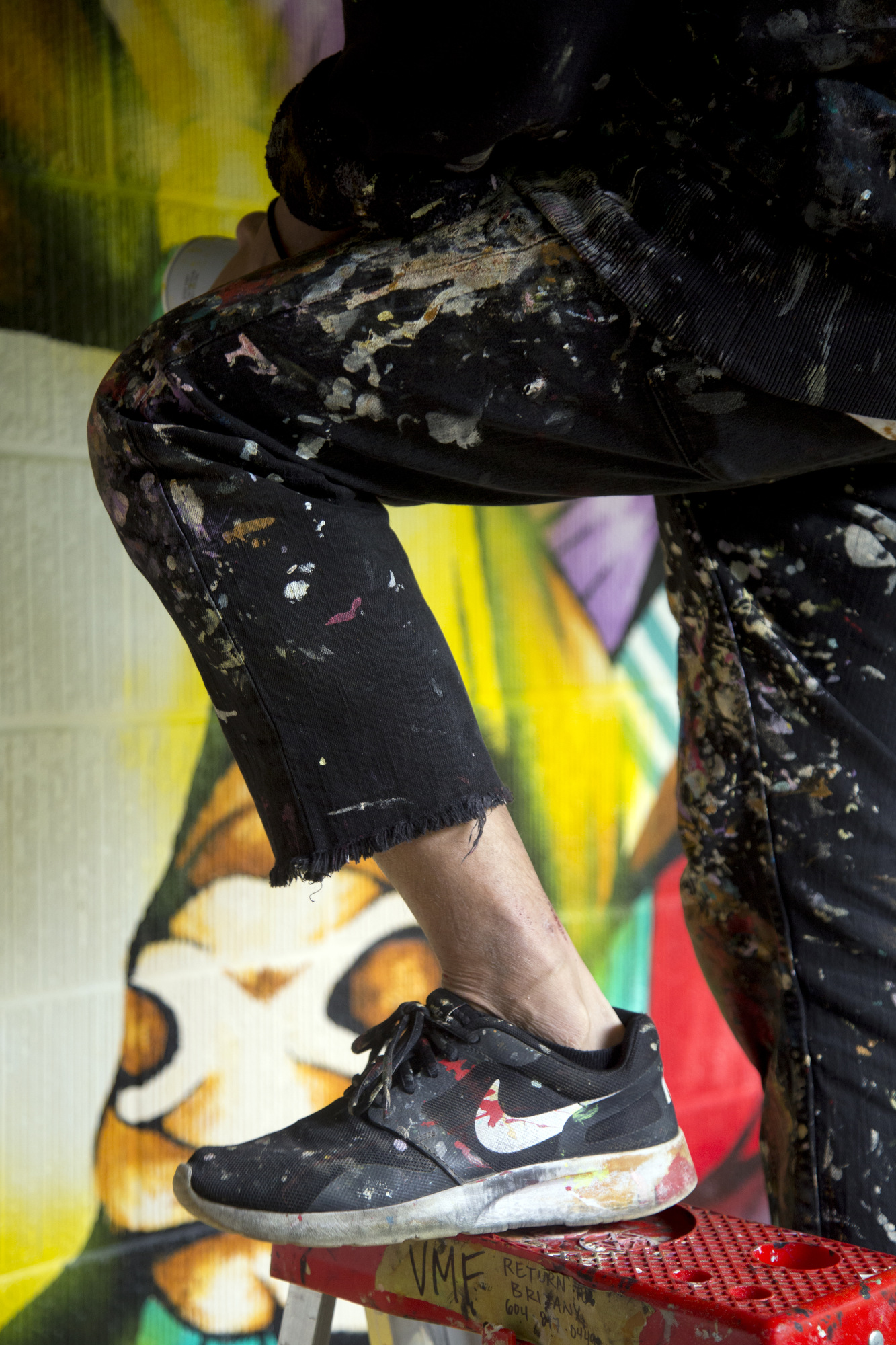
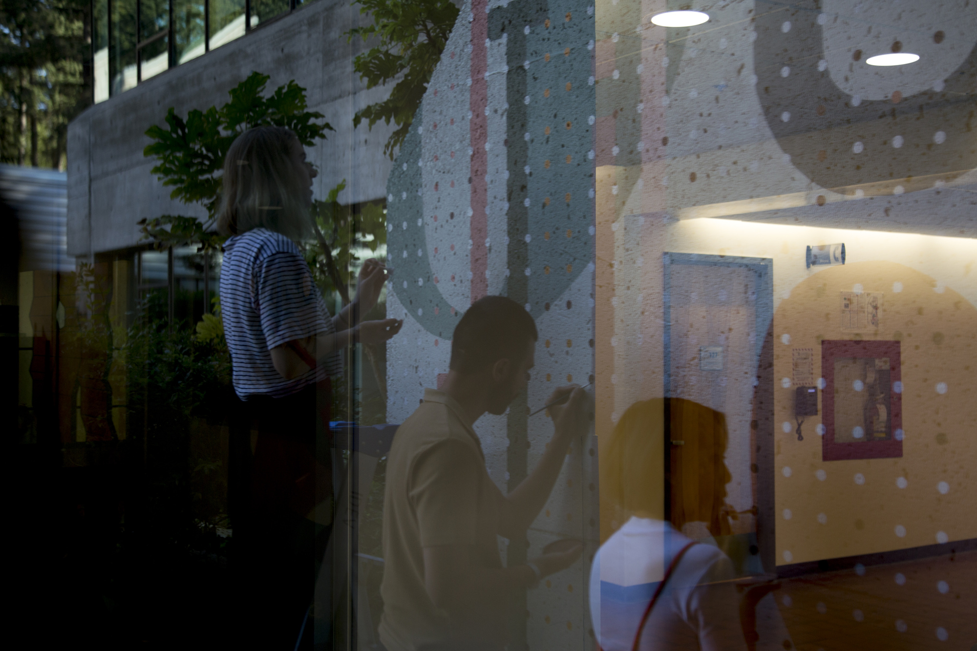
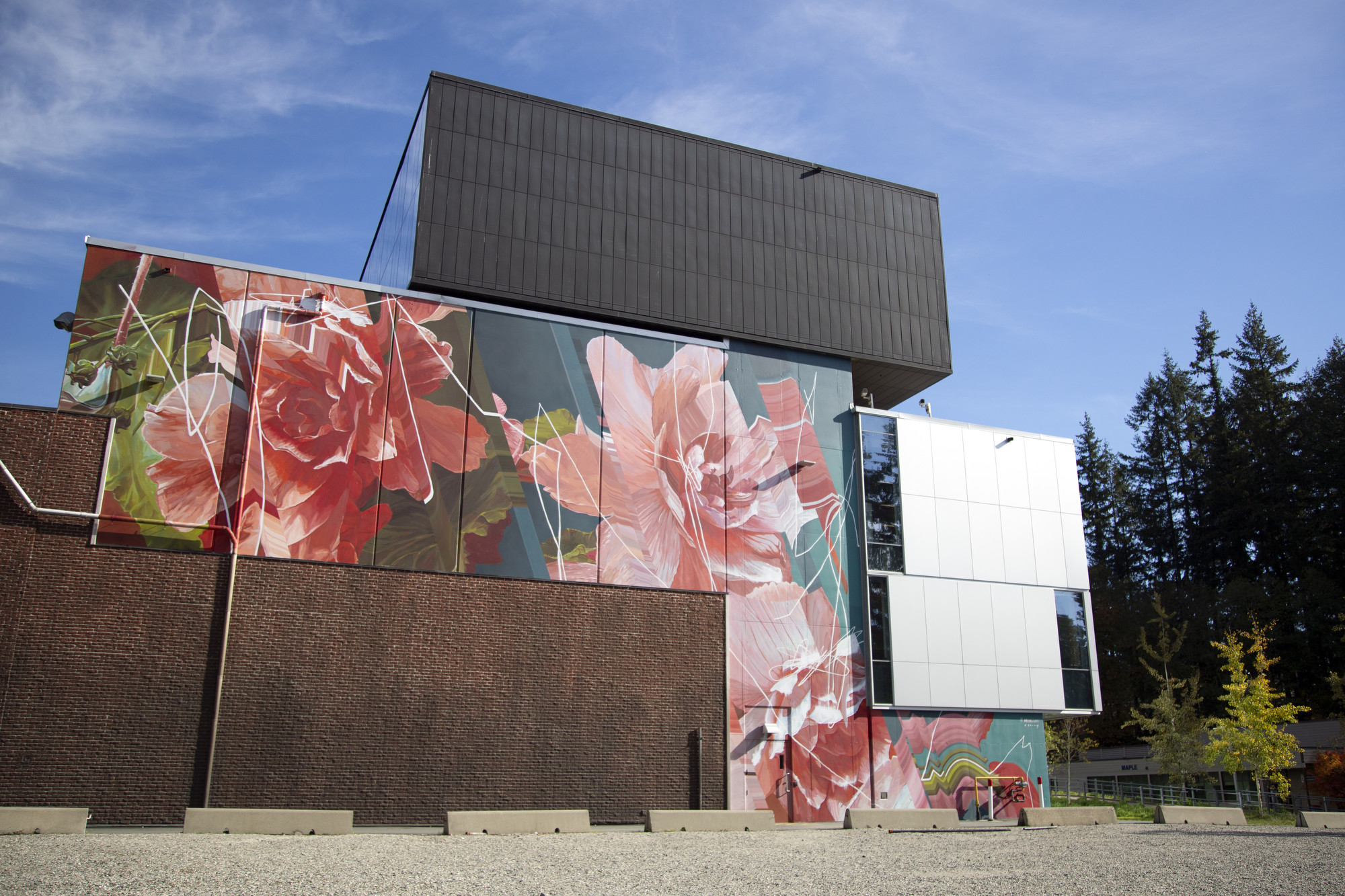
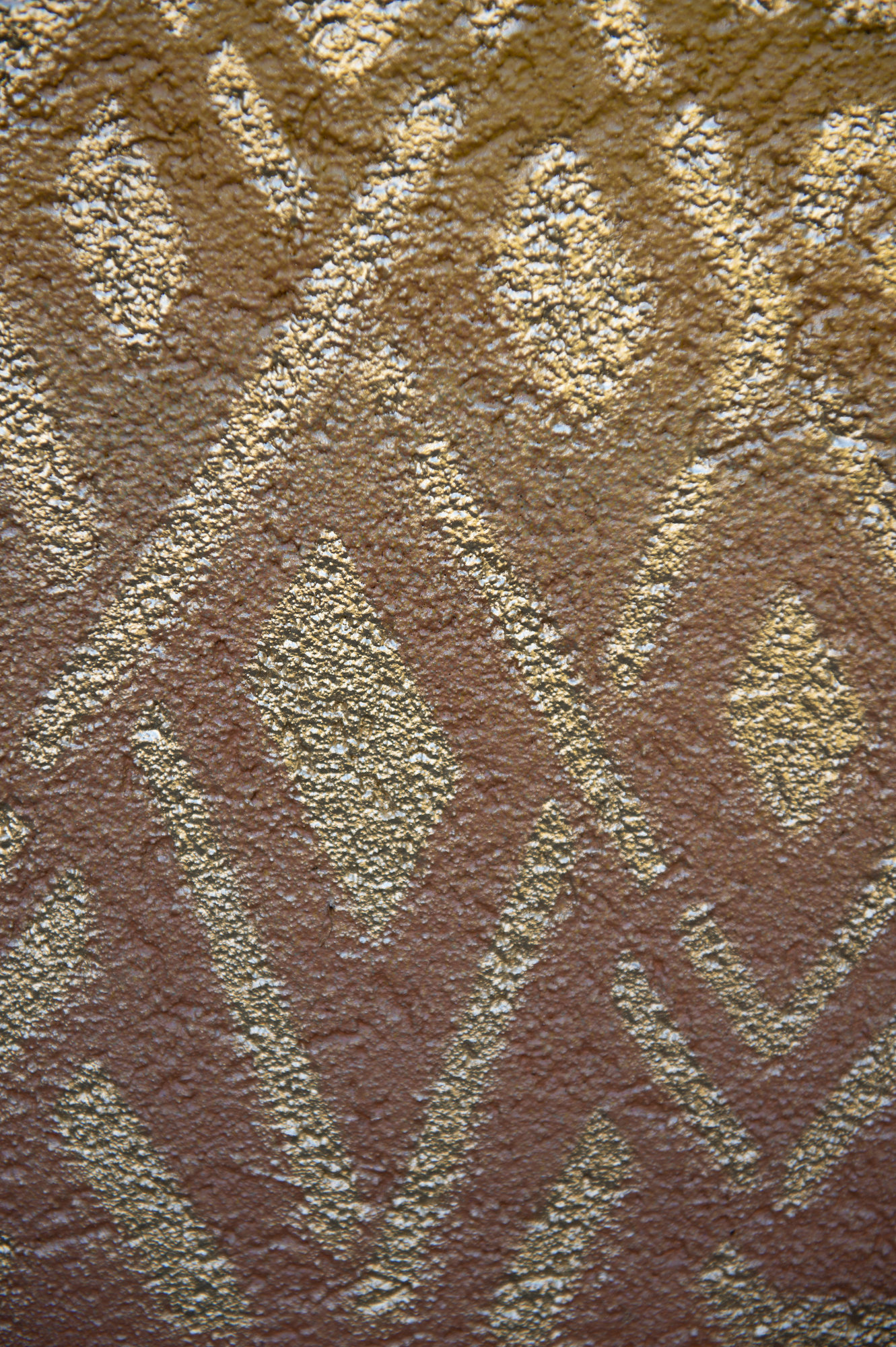
TAKA SUDO
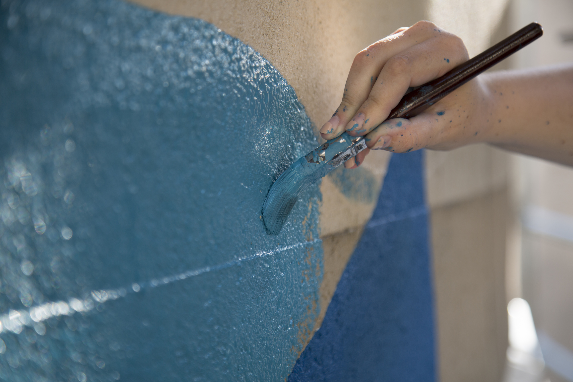
Murals are public art and people can enjoy them at any time, day or night.
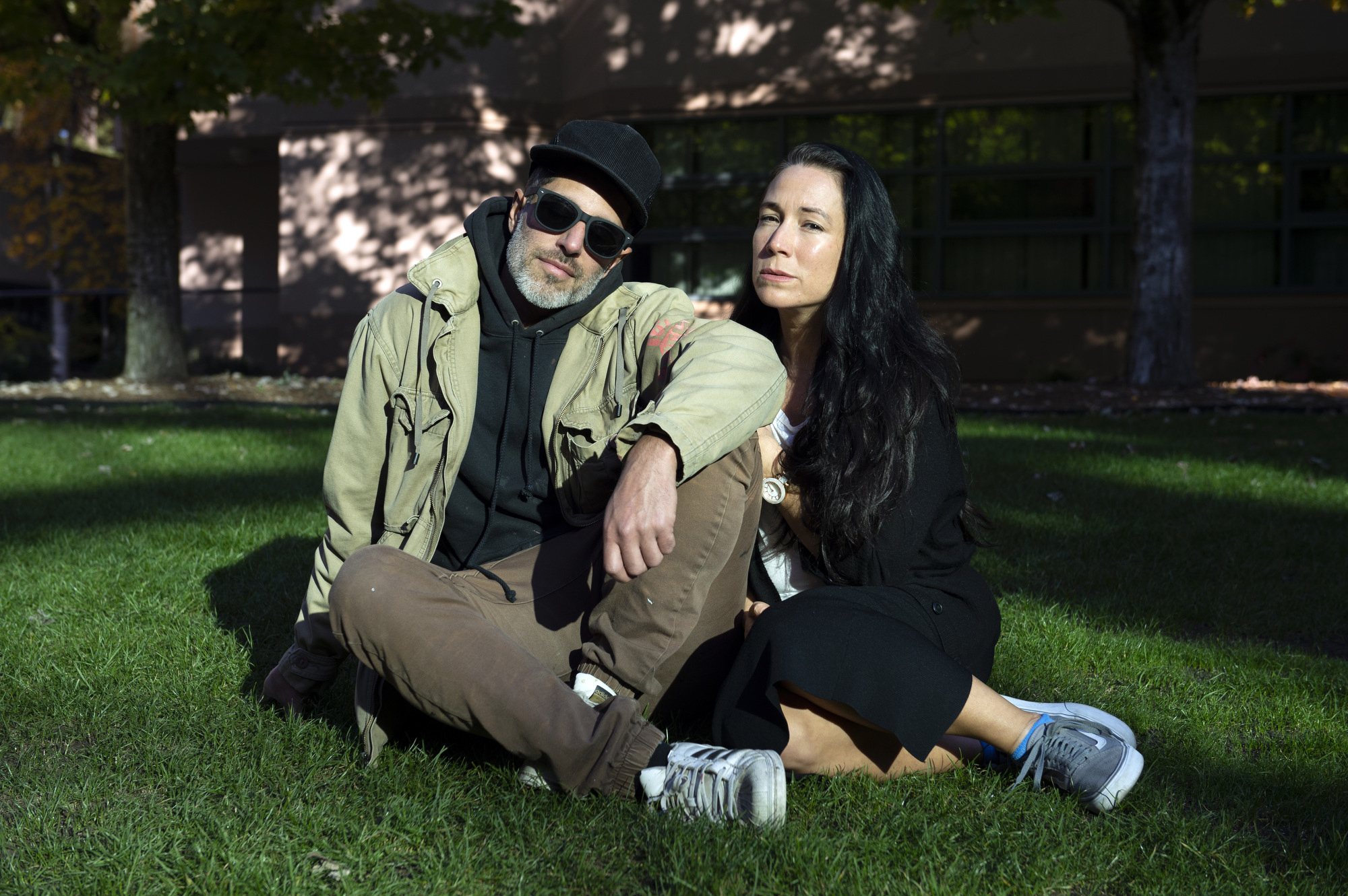
CARRIELYNN VICTOR & DEBRA SPARROW
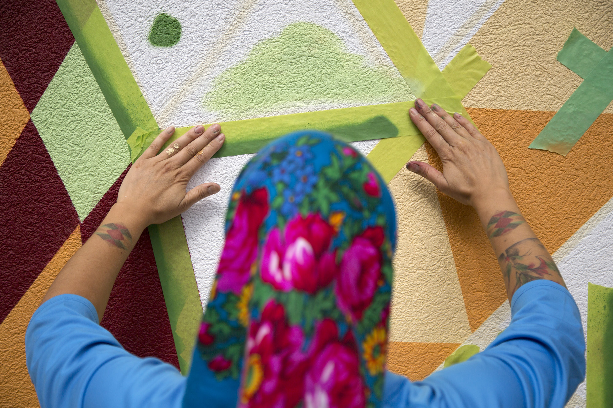
I love to see a concept turn into a large-scale mural and to see it happen in a way I’ve envisioned it. I also love taking a space that was previously dull or dirty and filling it with life and colour.
— Carrielynn Victor
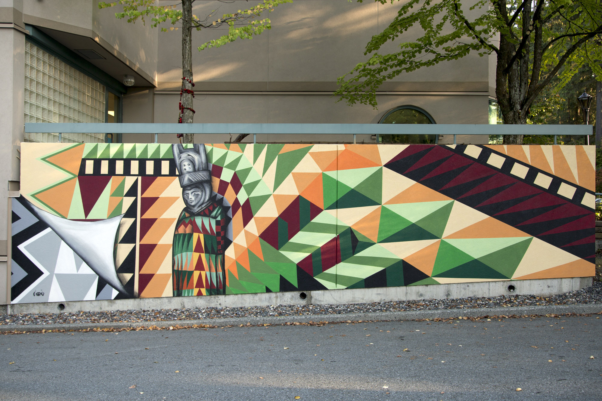
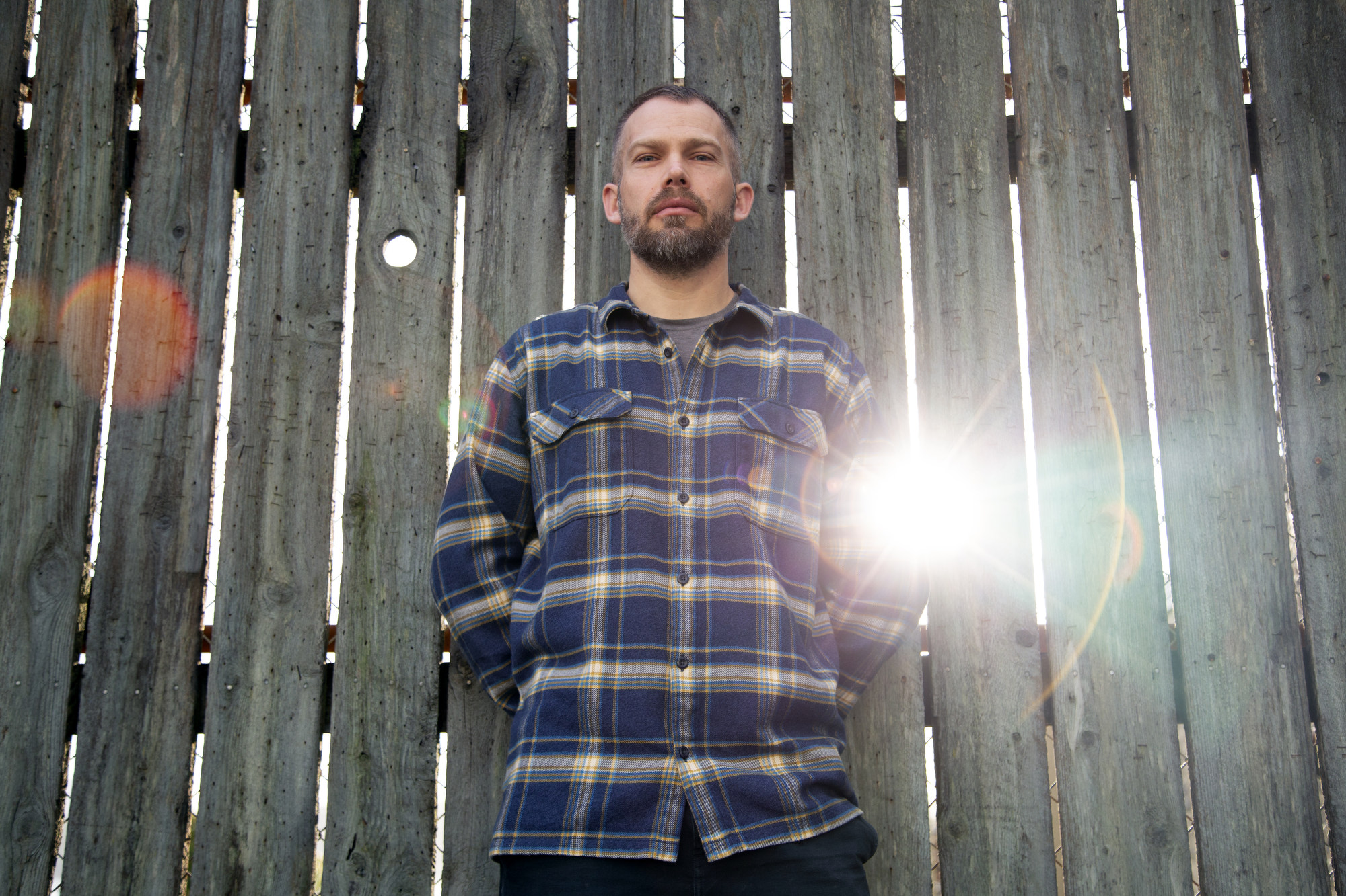
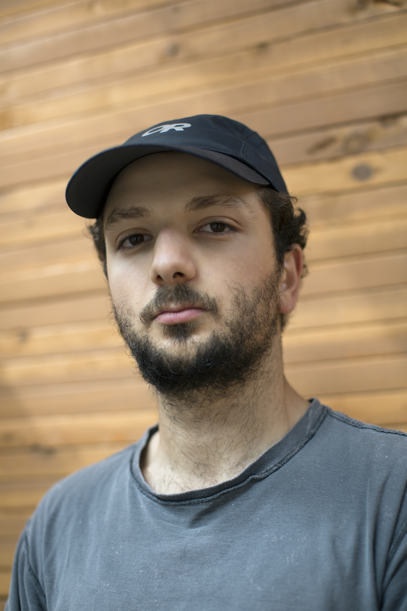
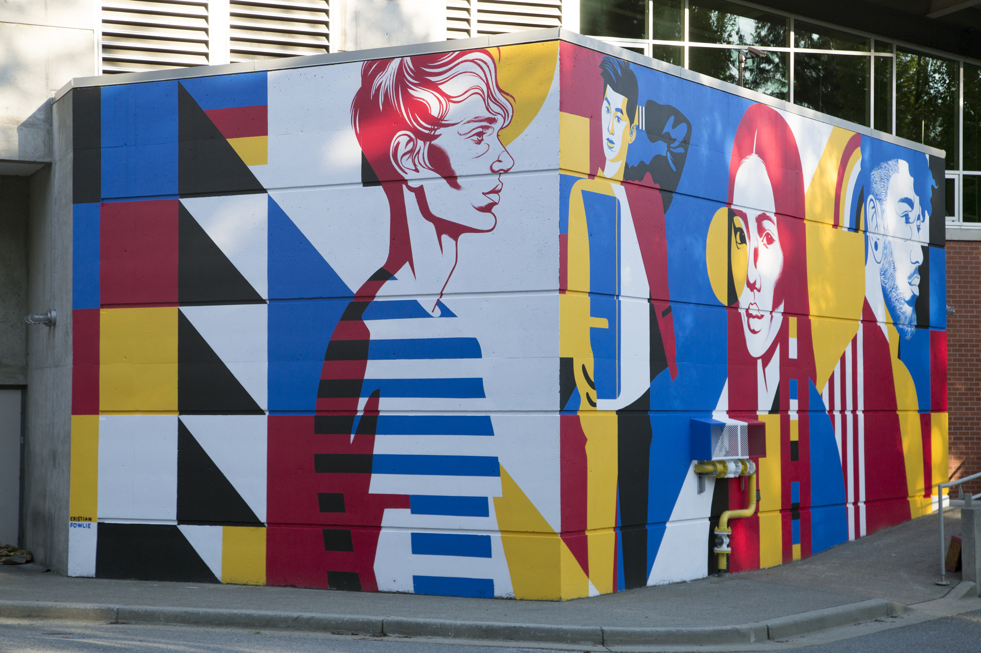
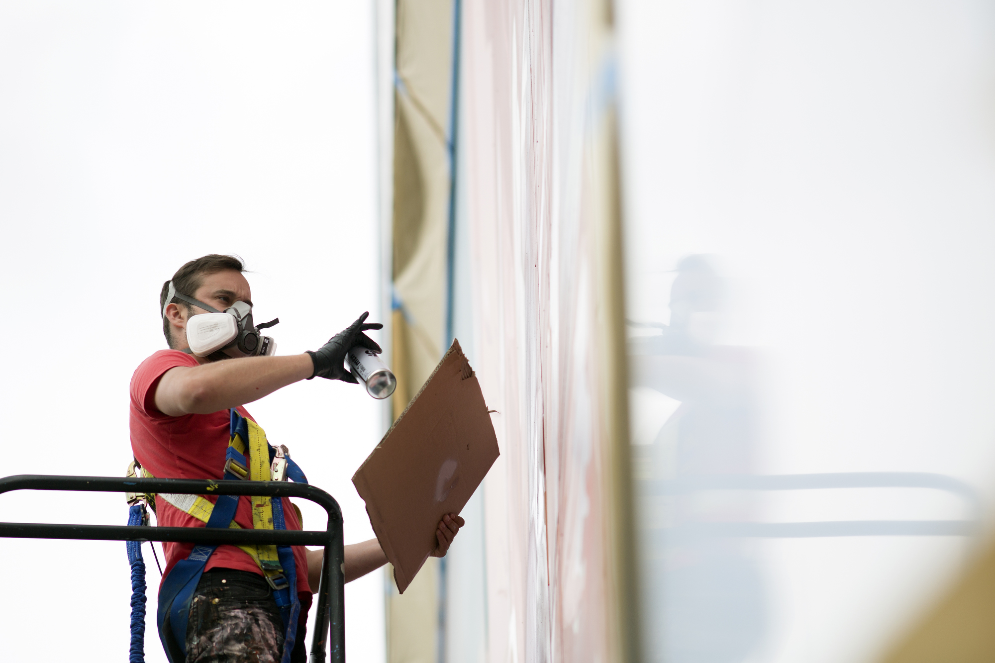
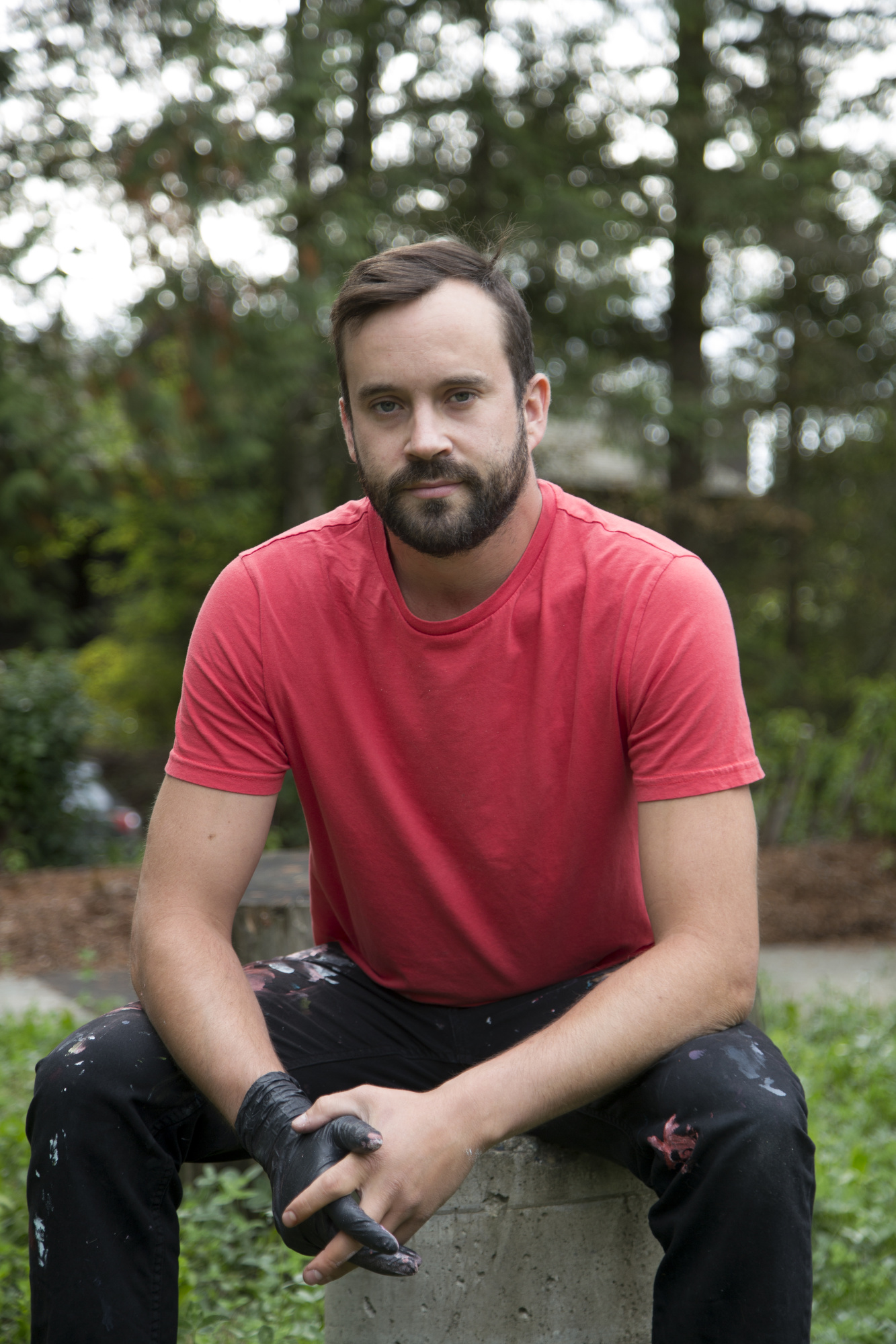
CRISTIAN FOWLIE
As a graphic designer, I find murals require a different approach than my other work. They require more impactful graphic elements, so they can make an immediate impact on the viewer.
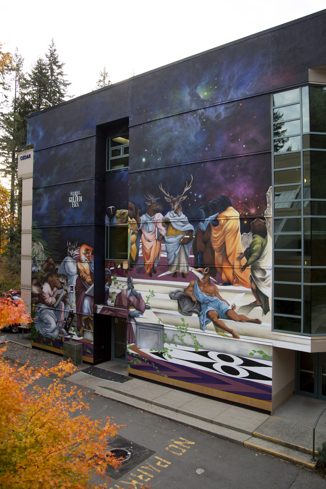
An old 2013 sketchbook from his days as a Capilano University student provided the inspiration for illustrator Cristian Fowlie.
The original sketch was a visual collection of the core artistic concepts Fowlie was then learning about at CapU, rendered in vivid primary colours and basic shapes. It used simplicity and urgency to link art history — Mondrian, Modernism and Peter Saville — with colour theory, geometry, anatomy, portraiture and graphic design.
The mural is clear, direct and vivid, rendered in red, blue, black, yellow and white. This limited colour palette gives the completed mural strength, providing an immediate sense of familiarity with the basic artistic concepts whilst also giving the essence of abstractness.
Fowlie is pleased when people claim to recognize individuals portrayed in the completed mural, or even see themselves in it, but the work is abstract, capturing attitudes rather than individual likenesses. The concept of a prism refracting and separating pure light into a spectrum of colours is a metaphor for how the university provides an array of experiences and perspectives that enable participants to create, collaborate and grow in confidence.
ERICA PHILLIPS
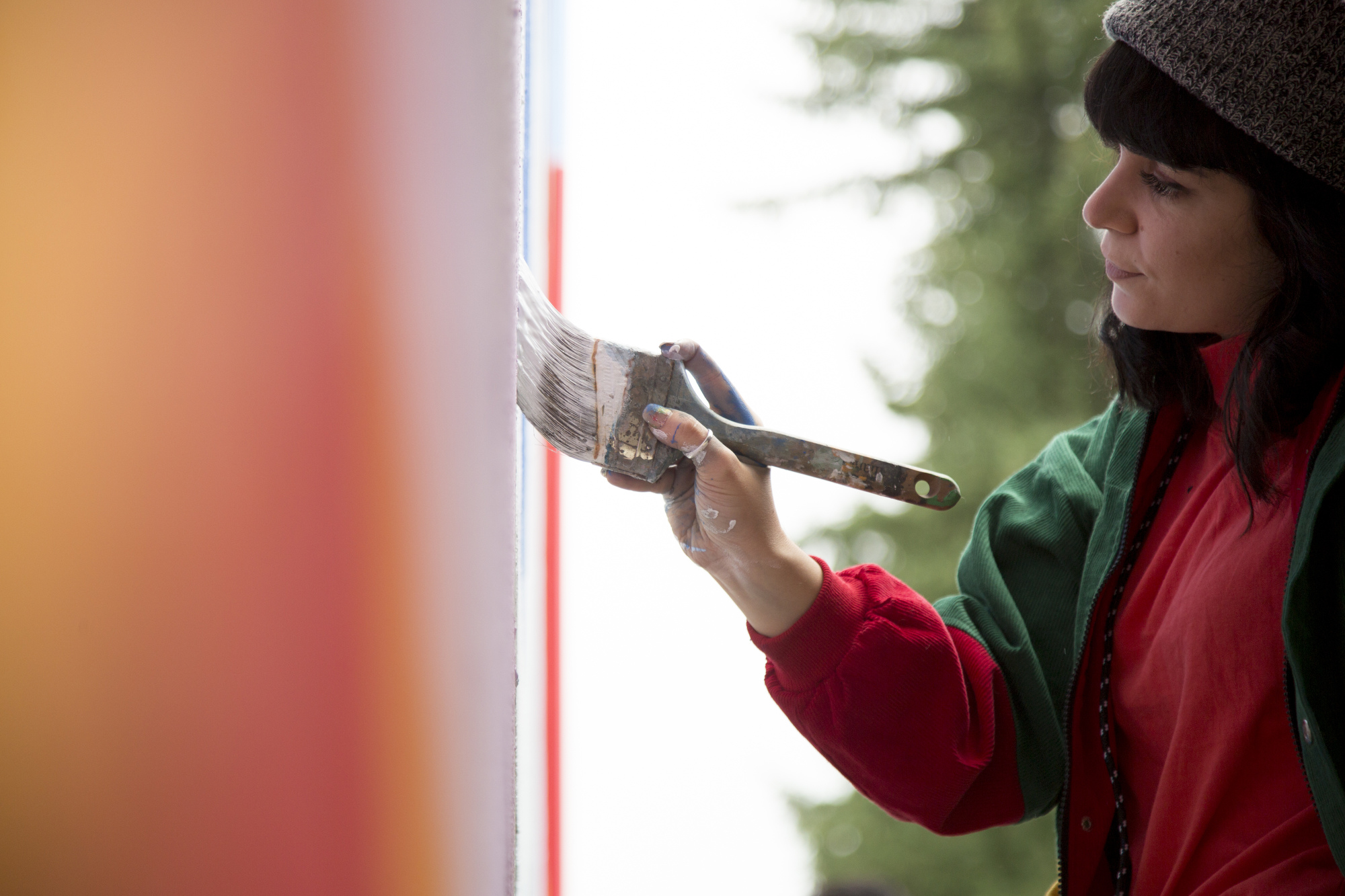
I enjoy the physical aspect of painting a mural. You have your whole body engaged, in motion, to create something much larger than life.
NELSON GARCIA & XOCHITL LEAL
Murals are billboards for the people.
— Xochitl Leal
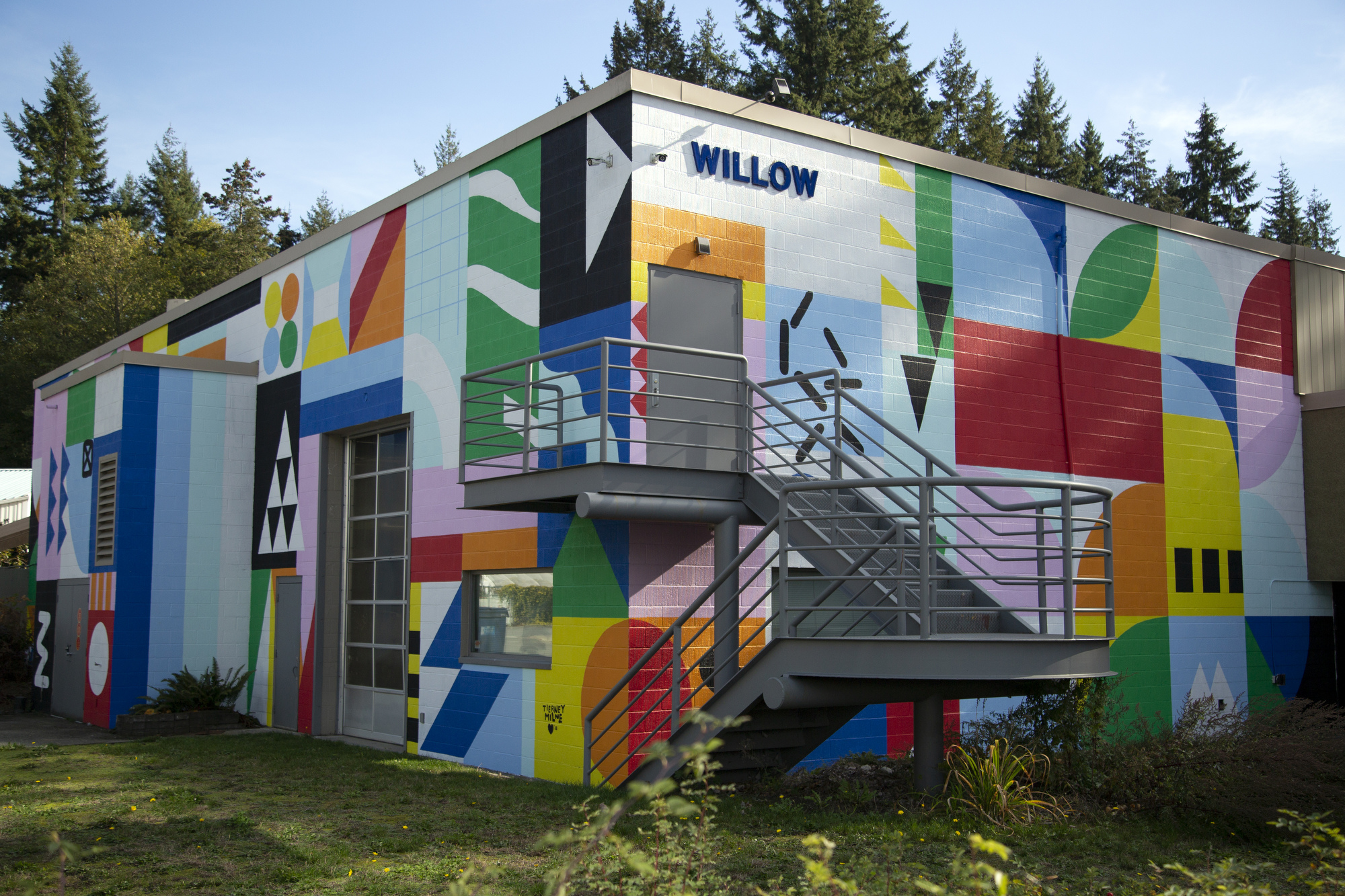
TIERNEY MILNE
I like to use murals as a way to interrupt people’s days with positivity and beauty, to create something that speaks to their inner child and encourages them to feel light-hearted.